Accessible Japan
Logo Design & Web Redesign
Promoting accessibility through design: Accessible Japan rebranding
Japan, a top tourist destination, is yet to fully showcase its accessibility and inclusivity. In collaboration with Accessible Japan, the country's premier English-language media platform for accessible travel, we embarked on a journey to create their new visual identity and website. Drawing inspiration from a traditional Japanese 'hanko/inkan' and the symbolism of interlined wires representing movement, the new Accessible Japan logo is a unique visual representation of the platform's mission to make a lasting 'print' in various locations across Japan and inspire others to follow suit.
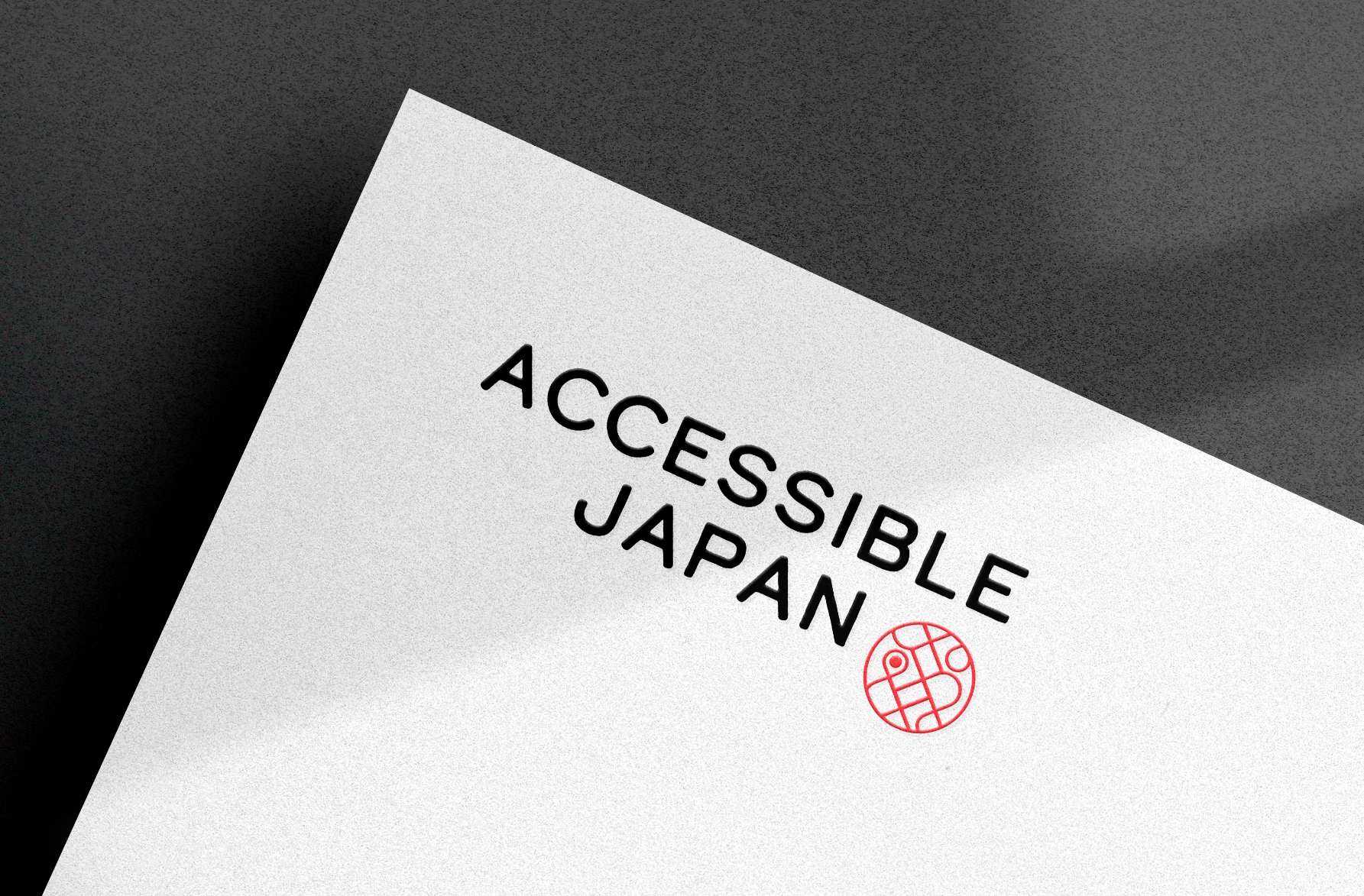

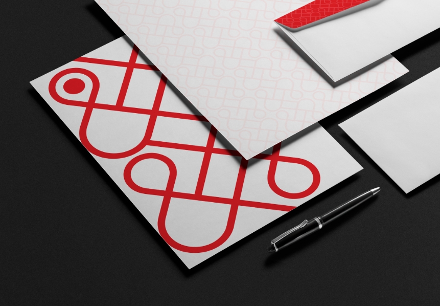
The logo mark was inspired by the inkan, a traditional personalized stamp that corresponds a signature. Inside the mark are roads that form ampersands that signify Accessible Japan’s commitment to inclusivity and accessibility.
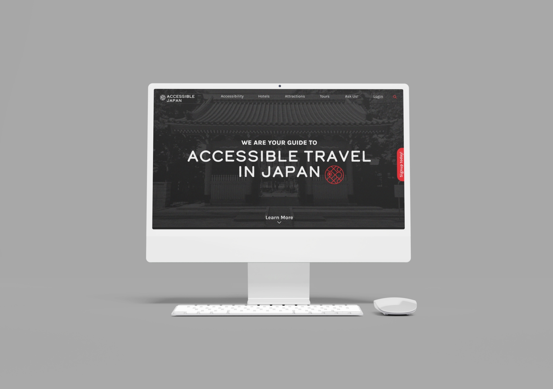
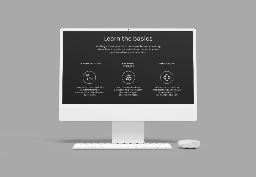
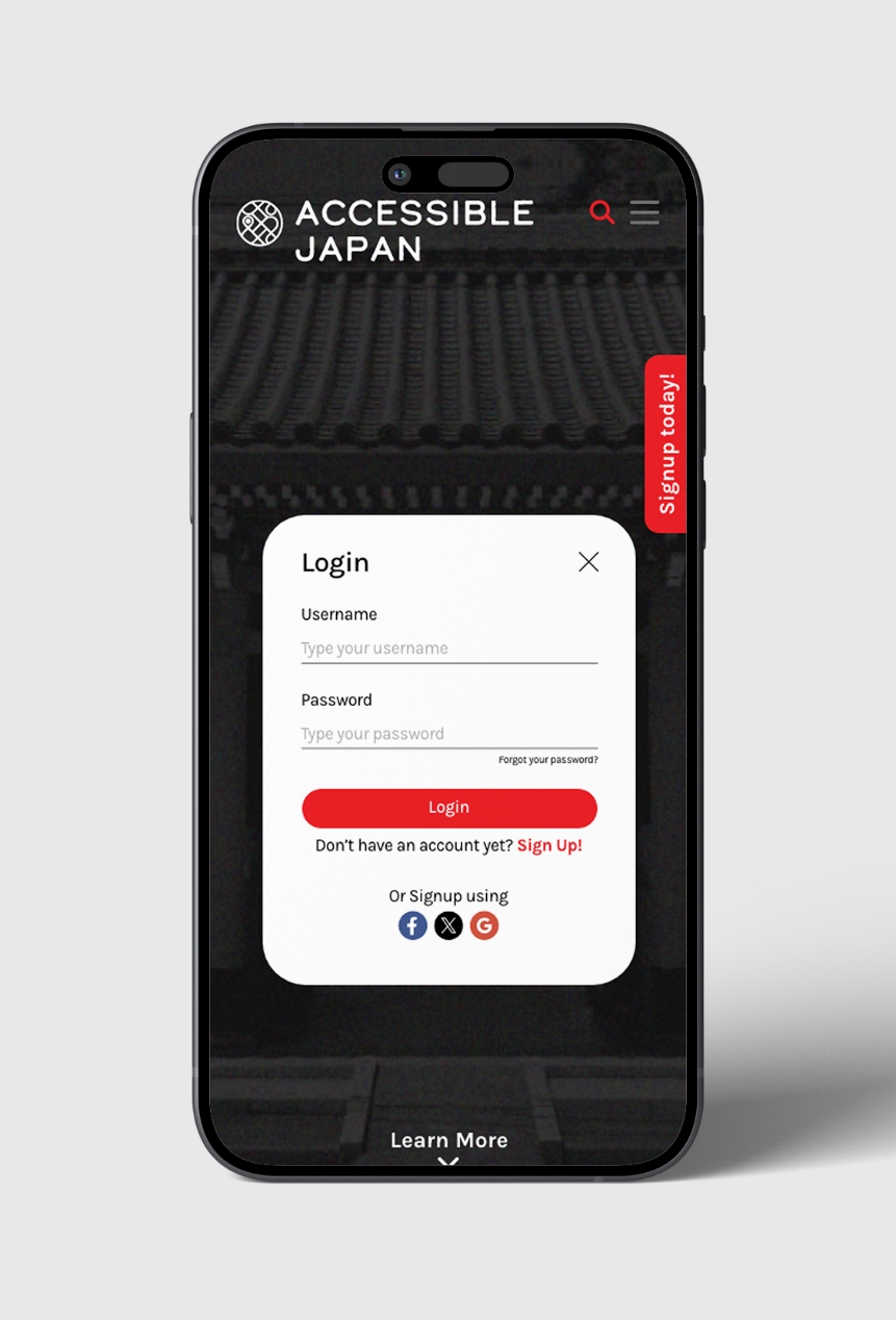
The landing page is set in a dark background that helps people with visual impairments navigate through the website better.
Project Manager
Seiya Hongo
Design
Jake Dolosa
Producer
Seiya Hongo